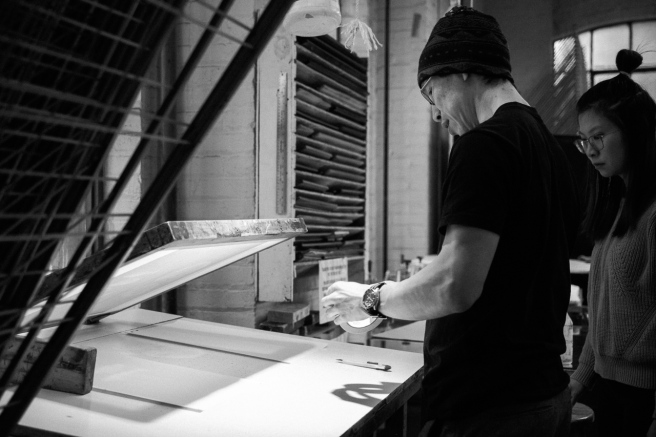
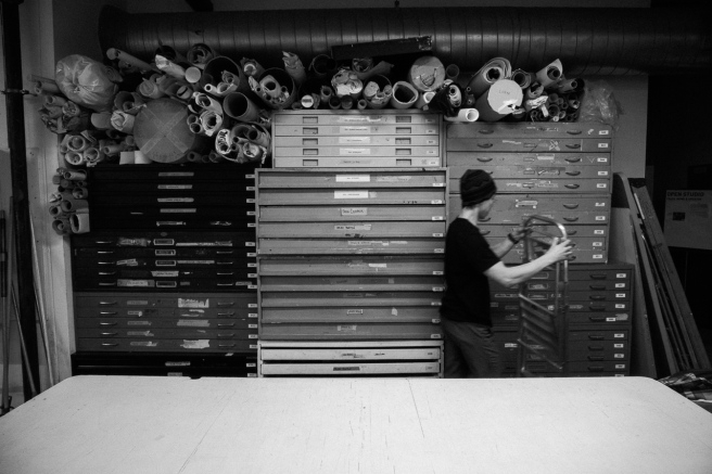
Had the opportunity to visit the print shop my friend Markus is doing some silkscreening over the christmas break over six months ago, finally processed the pictures. 
It took so long to process these is because I was trying to get the pictures to show off the nice rainbow inks he was printing with. It never felt right. There was too many colours, too many different colours to make the pictures come together as a whole.

Soon as I converted to black and white however it clicked, the light was surprisingly good thanks to the window and the work lights, but it was really hard to see with all the colours getting in the way. I think these pictures are much better served in black and white than in colour despite my initial thought of the importance of showing off the colours.
I wanted the black to be really dark to accentuate the window and work light on the work surface, he’s arms and occasionally he’s face. Trying to emulate the look of tri-x but not recreate it.
Through doing this set of images I learned for me colour could get in the way of seeing the light. I had a hard time seeing through the mix of window light, artificial lights with both soft white and blue-ish, not quite daylight colours, perhaps in these sort of situations black and white really is our friend. Throwing away all the colour reduces distraction leaving us pure light.